Sunday, February 14, 2010

Sew much more...

The good thing about having a meltdown; if it's an hour, a day, a week , a month or longer is that at some point you get sick and tired of being sick and tired.

That's when you say, "Self, what is it that you know how to do that always makes you happy?"

For me, it's sewing. And anything to do with looking at patterns always, always relaxes me.

If there is a death in the family, say one of our pets has died, after the burial, I have to find a pattern store. One day, in 1991 my son Joshua's pet rat died. We took it to the vet because she was sick. She was two years old and the vet said she was not eating because she was old and there was nothing we could do for her.

Well, my 13 year old son decided it would be in her best interest to have little Estey put to sleep.

We cried.

We went home, found a box and a towel, a shovel and a tree to plant. I shoveled some. He shoveled some. We cried.

Later, when my husband got home and Josh just wanted to veg out in front of the T.V., I went to the Rag shop and sat for two hours looking at pattern books. I may have bought a pattern or three. Some fabric. Some thread.

I felt better. The tree has beautiful yellow

flowers that attracts yellow butterflies. In the hurricane of 2005, it got pushed over on its' side.
It didn't die. It is still growing, pushed over on its' side.
Estey resides under the roots of the tree.

In 1999 Tabby, our 20 year old cat died. Buried in the back yard. In June of 1999 Lady, my beloved 17 year old Doberman died. She was cremated. Her ashes are on my bookcase shelf.
2008 was a difficult year. We lost Daphne our 14 year old persian/siamese, Squirt, (from my sister Joann who died in 1993 and I got her cat), and finally, Liz our 13 year old boxer (ashes on my
case) all three died that year. I was a wreck.

I spent a lot of time at Joann's looking at and buying patterns and fabric.
Two weeks ago, I took out my box of favorites and spent some time dreaming. Later I pulled out some linen fabric and began to layout, cut and sew.
Now I have six new long, fishtail linen skirts to wear to work.
I have mourned my heart attack.
I feel better.

Thursday, February 11, 2010

Melt down


Had kind of a melt down about two weeks ago. See, I had two small heart attacks the end of December and the beginning of January.

This spread is a bunch of photos taken with the little Zumi camera I had in my purse while in the hospital.

I'm OK, but now on drugs that cost over $300.00 dollars every month. Made me feel kind of weird and dizzy too, the first few weeks I was taking them. There's a blood thinner that makes every pin prick bleed for an hour.

At first I was in shock. This couldn't be happening to me! I have been walking almost every morning since the birth of my second child, 34 years ago. I have been on a low fat, no meat, low salt diet for years and years since it seemed like the healthiest and sanest thing to do. grrrr

A week after I came home I got sick with a cold. Am still coughing now! Fevers still coming and going. Rats!
This is pissin' me off. This is the anger stage. Then I got sad. Now I am used to the idea. All stages of grief for the official loss of my youth. grrr.

Guess I shouldn't be surprised. My mom died of a second heart attack when she was only 60 years old.

And you know what, she died on the same date that I had my second one. January 3rd. How weird is that?

Sure do wish we had health insurance. But, maybe it's a wash. If we could pay $2000.00 a month for the basic plan we could qualify for, it would have been $24,000.00 a year. By the time we get the bill for this fiasco, with the cost of E.R. care, in patient time, blood tests, a bill from an ambulance company for transfering me to a hospital that has a cardiac cath lab, and individual physician charges, I bet it will all add up to about that.

This sucks. But, I am over it now. I am glad to still be here to have this worry. I see beauty everywhere as I always do and now am even happier I have had more time to enjoy it.

Sunday, January 24, 2010

Reverse color portrait -


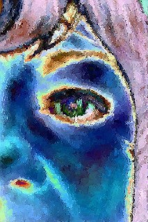
Today I started with acrylics to do a reverse color portrait of a photo of me.
I had reversed the colors in my Paint Shop Pro software and liked the brightness of the colors in reverse.
I also fuzzed the photo a bit with the brush stroke filter.
Copying the photo was Hard!!!

Ultimately, I used less colors than the photo, but finished the exercise when I felt like I had done enough!


Sometimes, just time finishes a project for me. At least with this drawing and painting stuff.

When I make a skirt or knit top, enough comes with the final hem. That is a nice bonus with sewing. There is an obvious stopping point.

Not so with drawings and paintings!

Oh well, what are you goin' to do? I have too much paint and too much paper hanging around to quit now.


The other interesting thing is what happens when you take a photo of your work.

It's an opportunity to see glaring flaws.

This left eye crease shadowing is too well defined. The eye color is good, though.


The right eye looks OK, but I'm still working on tilted faces.

The angle of the eyes and cheekbones require a lot more attention than a full front drawing.

Additionally, I did a very fast sketch in order to get to the color and perhaps that limited the shading effects.

Still learning what I like to do.


Close up of the right side eye shows lots of color in the iris which is something I know I like to do.

Acrylic paints are a challenge! They sure do dry quickly, and sometimes that is good because I can lay another color on top to change direction.

Of course, using glaze is a option and is a really great way to go over a graphite sketch to "nail it down", but today's play was just that.

Play.

Very good, Adrian! Now smile and when you come back in a week or two, this is gonna look even better.

Wednesday, January 20, 2010

A graphite portrait -


This weekend I picked up my pencils again to see what I could do with graphite and no paint to confuse me!

This took a few hours, but it was fun to do. I'm not so happy with the paper. It is a 9 inch by 12 inch, 65 lb. sketch pad that I am dedicating to just portraits, but the paper seems to fill up with graphite very quickly. I've noticed that drawing on watercolor paper is a lot different. The graphite smears more and I have a much easier time getting shadows and shading the way I like. Oh well, live and learn.

Does she look black and beautiful?

I think so.

Thursday, January 14, 2010

January - day 2 of journal

Day 2 of January journaling.
Since I was taking so many photos with my new Zumi camera, I just had to put them somewhere. This was so much fun! I know it's hard to see these photos, but they are intensely colored and slightly grainy.
so cool.
I printed out 9 to a photo page and then used a punch to cut them out. Since I just couldn't limit myself, I made a little booklet of water-colored paper and double-stick taped them down.

Adding more photos to the page is easy when you have a journal within a journal - yes?


Did some stitching to decorate and secure the booklet and the pix.
The background page is gessoed,water color spray painted and highlighted with wax pastels in rose, one of my favorite colors.
See how the booklet opens? My first.
sigh.


This is page 2. More pix, more color, more fun.
It was a chance to use some stamps to "auto journal", too.
My husband, the house, our dog, Candy is her name, the feral cats eating (they're always eating! I feed them three times a day!) the pool, the sky, my garage/studio, a messy unmade bed.
All good fodder for fun camera pix.


See! Page 2 on page 2 opens two!


And this is how it looks all closed up and done.

Happy Saturday, January 2.

My new Zumi Camera!

I got a new camera!!!! It's a Zumi! Formal Name: Digital Harinezumi 2. How's that! It's a wonderful, little, digital, plastic lense camera that even takes videos!!! Yeah!!! Last year I got a Holga and loved the pix, but couldn't keep buying all that film. Now, I can take hundreds of photos and load them into my computer to pick and choose which ones to print. Oh, how I love this camera! It has two ISO settings- 100 for daylight and 800 for low light conditions and it even takes black and white photos with just a few pushes of the few buttons that are on this little camera. I got it on-line at www.photojojo.com - the place for cool photo stuff! I cannot stop taking pictures!!! My pix look like I have an old camera that is slightly amused at being asked to take pictures because it is so not perfect. Love the distortions, love the grainy-ness, love the super saturated color I sometimes get in daylight, love the strange color tinges that come up, and it is so small! Fits into the palm of my hand and I just point and shoot. There is no window to see you picture before you take it, but there is a nice review display so you can delete a photo if you want to. (I never do, I'm in too much of a hurry to get another photo and see how it turns out. Everyone is different because the effect of changing light conditions changes your photo amazingly.
My P.T. Cruiser never looked so - interesting.
Our Florida sky never looked so - painterly.
Our house never looked so -blessed by the Light.
And, I never looked so - mysteriously curvy?
Oh, I am in love with technology. Thank you PowerShovel,Ltd! Fantastic! Fun! Fully functional and all mine......

A New Year, a trial journal -

OK, so I'm taking the plunge, like so many others. Taking time to do some art in a journal of sorts.
Not worrying about how much I do.
No rules.
Get to it when I can.
Do it when I feel like it.


First day of January - easy peasy because I don't have to go to work!
Yeah!
Step 1. Flop around my garage/studio with some music on and a few spray bottles of watercolors in pretty Florida colors.
Step 2. Use double stick tape to adhere some photos. So easy and so not messy.
Step 3. Sew the photos down with metallic gold thread (my favorite- hands down, all time, go for the glitter even though it shreds occasionally)


Step 4. Take some pictures.
Step 5. Admire.
Step 6. Take a nap.

Saturday, December 26, 2009

Playing with Oil Pastels

In July of this year, I participated in Pam Carriker's Pursue Portrait class.
Well, participate is a broad term. What I did was make several pencil drawings.
At that time, I just could not bring myself to add color to any portrait work at all.
So, for most of the class I monitored and observed what my class mates were doing and I guess I stored it away for future use.

As I was attempting to put some order in my garage/studio yesterday, I came across the sketch book with the portraits I had drawn.

And, having just gotten some Sennelier Oil Pastels over the past few weeks from Dick Blick on-line art supplies, I stopped cleaning and just sat down with this.


I soon had a sore index finger. These things are crayons. Very soft. Buttery, in fact. Nice to apply, easy to smoosh around, but doing an entire 9 in. by 12 in. area is too hard to do with one's finger!

I took up a couple of stencil brushes and used them instead of my finger and blending the oil pastel colors was a lot easier. I used the very edge for detail work around the eyelids and for coloring the iris.

The whole process was a lot easier than I anticipated. However, next time I'm going to use them on studier paper. The sketch pad paper was only 65 lbs and it didn't take long to fill up the surface and it felt as if the colors were sliding around on top of each other.

Not that it really mattered. This was an experiment and it went well.


This is what it looked like as a pencil sketch. Pam Carriker gives you a basic face to try out at the beginning of her course, so it's good for all us beginners.

I see improvements in my sketches now and thanks to Mystele's Gut Art class, I finally, finally got the courage to work with color.

So, now I have a small amount of experience with graphite pencil, colored pencils, acrylic paint, water soluble oil pastel, PanPastel and now, oil pastel.

It's no wonder my garage looks like an art supply store.

Monday, December 21, 2009

PanPastel play


This is a small, about 5" X 4" size, and I'm not used to working small, angel done on a piece of office depot paper I took from my printer.
My computer had been working even slower than usual, so while cleaning up and moving files on Saturday, I made five small sketches for fun.
With a 4B pencil and the PanPastels from the 10 piece Painting Set, I smudged my way to this little angel.
These pastels are amazing! Not dusty, very intense colors and so smooth.
I'm used to working on larger spaces which gives me room to play with coloring the eyes, so this small format was - different. Just the lightest touch of the side of the Sofft tool was all that was needed to put a blend of color on the iris. The wings were fun, though.

This was a small, torn piece of watercolor paper that had a text stamp on it. I was just practicing making a face, not using anything as a reference, and before I was done, the halo appeared. sigh.
I guess all the Christmases of my childhood are seeping in because this doesn't look like just a girl to me, it looks like all the pictures of Jesus that were hung on the walls of the Presbyterian church I attended as a kid.
Of course, if Jesus was born in the middle east, he would not have looked like this, but this does look like the white Anglo-Saxon version printed in all my Bible study books.
Childhood experience really is imprinted strongly in brain and body memory.
After completing nursing school, I began studying Judaism and found its' teachings of personal responsibility for personal actions more consistent, so I converted. Now I was a stranger in a strange land. I didn't have the same background as the Jews I was meeting, but the warmness they extended to me more than made up for it. It took years for me to not want to put up a Christmas tree, though. And, memories of singing Silent Night in the church choir still peal loudly in my head this time of year.


This is the practice paper. All the stuff I've been reading about using the right kind of paper for the particular art media was suspended. Like a kid with crayons, I remembered that if you have a white piece of paper, you can color it!
Why are there so many rules? Why does everything have to be perfect? Why do I listen to everybody else?
And what's so important about being perfect, anyway?

Sunday, December 20, 2009

Chanukah and PanPastels


Friday night was the last night of Chanukah and so the last candle was added and what a nice space of light it makes.

This is a photo taken with no flash.

My favorite.


And, this one was taken with the auto flash. I am always amazed at the pictures this Canon Digital Elph SD800IS takes.

I've had the camera for about 2 years now and I like it because it has a function that stabilizes the image in spite of any shake your hand might do.

Sometimes however, you want a blur and boy do I have to swing my arm to get it!


This week when I came home for lunch I found some PanPastels waiting for me. Oh, do I love the mail lady!

This is a quick play with a Love stamp on watercolor paper. Wow! do these colors blend!!!

I bought some bright colors and pastels to try on some portraits.

We'll see what happens.

Saturday, December 12, 2009

Glass Art Pendant

A great way to use your own art is to make a pendant!
I got the inspiration from Willowing on youtube -

http://www.youtube.com/watch?v=-XT5ZOATsWw

She uses a wonderful little kit put out by Annie Howes -

http://www.anniehowes.com/056.html

It comes with some pretty papers, pendant glass, glues, bails to hang it with and some black cord to tie around your neck to wear it right away.

It also comes with complete instructions and lots of good tips.


I used some 7 mm silk ribbon and a plain hook and eye to fasten it.

Since the back was plain white paper, I added color with some ink pads and a small word stamp.

I am lazy and didn't want to go out to the copy store for prints of my art, so I used my ink jet printer and sprayed the images with fixative.

When that was dry I gently brushed on Golden's UV gel to seal the image and protect the colors from fading.

Surprisingly, when glued to the glass with diamond glue, non of the image ink ran. Whew!


I resized the photos of my artwork down to
7/8 inches and copied and pasted them in my Microsoft digital imaging software.

To print this out, I used Great White Imaging Photo Paper which is heavy and smooth, and not as thick as regular photo paper.

This was fun and easy to do. What else can I do with my art work?

Sunday, November 29, 2009

Sondra - a portrait


This portrait is now my favorite.

The colors are blue,purple, yellow and orange and work together nicely.


When the painting was completed and I asked, "What is your name?" It took a moment for me to hear, "Sondra".

The meaning from Greek is, "defender of mankind." I guess that explains the angel wings that came about when I didn't know what to do with the background.


The background and pencil drawing shown here is acrylic paint on cardboard with some paper towel collage and sand for texture.

I like to use water soluble graphite to do the drawing and then go over the lines with a clear glaze medium to set the lines and blur them a bit.

Doing that keeps the drawing from getting lost with the application of paints. Something that I need to do at this stage of my experimenting.


And, I still like to use gesso for the skin tones.
Mixing it with glaze, I build up the face a little at a time.

Learning about the planes of a face is fascinating. I use magazine photographs to analyze lighting and how it makes the structures of the face appear.

Adding shadows with more graphite, which blends so easily, helps me define inward spaces. Color,which still scares me, is added only a little at a time with oil pastels.

When I have feeling for the facial colors, I like to work on the eyes. I use acrylic paints and graphite to make soft, expressive eyes. And, it's fun to add color from around the whole portrait into the eyes.


A close up of the face shows some of the texture on the base of the cardboard.
I'm wondering if I will continue with this strategy.
Maybe a smooth base will be better with the kind of faces I seem to paint.
My original intent was to create folk art pieces, but I don't seem to have that in me.
Or, maybe this is just me at my beginner stage, still trying things out. Folk art may not be my style.
Mixed media is a huge and confusing art style.


Too many choices can be its' own nightmare.

However, when I see what can come to life with gesso, oil pastel and my index finger, I want to create more...

Saturday, November 21, 2009

"Beauty" - a portrait


This is another experiment in drawing and painting.
I still like to use white gesso for all of the white work.
I like the dull appearance , the fact that it can be watered down making light applications a nice way to build up the highlights and mostly, I like the way it feels when I rub the oil pastel into the paper


Working on a pink background helped me make color choices that were very soft and feminine. In fact, every experiment I've tried so far has been based on the colors of the base of the paper.
At this stage of learning, I do not like to fool with the background at all. Once I get some color, collage, and stamping done, I look for a way to put a face on the flat plain.

This is going to be a page in my gut art journal. It is a piece of 90 lb. drawing paper, folded in half and punched with holes ready to insert into the covers I've made. The other thing I am having fun with is the water-soluble graphite.
Oh, how it darkens when water is added. And the line softens so beautifully.
One cool thing to do is to go over the lines with glaze media. When it dries, which is almost right away, the lines don't change and I can paint over or around them without them disappearing forever.
An important thing to a newbie sketcher.


Working on this background will direct all my color choices, so I will end up with a "series".


I'm still totally enchanted with coloring eyes.
I want dreamy eyes.

Saturday, November 14, 2009

Moriah - Gut Art Portrait

This portrait was done in October while taking Mystele's Gut Art class. We were making covers for a journal that is to hold our thoughts and works of new art made during this on-line class.
I got so enamored by working on cardboard, I never did finish making the journal. Now I have several pieces of play on cardboard that I will probably just hang up somewhere in my home. The freedom I feel while playing on this humble substrate is just what I need right now. Too much structure on stretched canvas or even wood cut for me at Home Depot scars the play right out of me.
Am still too fragile in this art making thing. Will just move forward in quiet hesitation and hope confidence will grow with practice.

Saturday, November 07, 2009

Puritan Girl portrait

This little piece of artwork, and for me this IS little, measuring 5 inches by 7 inches, was done on a torn left over piece of watercolor paper that had a blend of yellows, orange, metallic gold and a few red dots stamped on it.
It just came to be. I didn't plan it. I didn't use any photos for shading reference. I didn't copy it from other work I have tried. And, I chose not to obsess about it. A first!
Sheesh, this isn't rocket science. No lives are hanging in the balance while I figure out what to do. It's just paint on paper.
Why does it always feel so momentous to do any little project? I guess it's really about being new at it. I am comfortable with fabric. Paints are an unknown to me.
And, still, I quiver in hesitation to begin a new project. I am off today. No work to go to. No shopping to be done. No laundry to catch up on. Nothing but freedom, and still I hesitate.

Oh, get over yourself! It's only paper, pencil and paint!

Saturday, October 31, 2009

Gut Art - continuing

This is the 9th portrait I've done while taking Mystele's Gut Art Class. Using a piece of cardboard, I applied black gesso and then added paper towels and torn book pages, plus sand for texture. Next came lots of acrylic paint. Some of it was craft paint which I like because it is so easy to apply, but I also used some heavy body paint that would add to the overall texture with brush marks and palette knife markings.

I just could not decide on a color scheme! The more I added and dried and added, the more I was unsure of the direction I wanted to go. So, at one point, I looked at the paints on my disposable palette and just sprayed water onto it. Picking up the cardboard piece, I then just smashed it down onto the paints and smushed on it with my hand.

A monoprint! Now the colors were soft and like a watercolor painting. I finally felt I was ready to begin.

Staring at the thing didn't bring up any obvious lines or areas that wanted to be developed, so I took off my glasses and suddenly the blur coalesced into a form that I was able to define with a watersoluble graphite pencil.

From then on, the painting just formed itself. The word, "diffident" drifted to mind and stayed, so I wrote it down and waited to see if something else would present itself. Nada. Okay, so this was it. The definition includes: shy, modest, irresolute and doubt. A fine description of my process for this painting.

Saturday, October 24, 2009

Gut Art with Mystele -

Part of the fun of taking Mystele's Gut Art class is viewing all the videos on her techniques for making all kinds of fun things. Last weekend I spent my time putting together a fun acrylic painted fabric wall hanging. Starting with some colorful cotton, I free quilted a bunch of cotton scraps and ran my sewing machine stitches round and round to make a textured surface of cotton.
Next was free application of craft paints using a palette knife. Letting each layer of color dry before adding more, kept it from becoming muddy in appearance and the colors stayed true. Once that was done, I had a very busy background, so I softened it with some gesso, and highlighted it with Liquitex Basics gold. Using a palette knife allowed the gold to ride the bumps made by my sewing and it was just the highlight I wanted.
Gazing at this background, I "saw" a face and "pulled it out" Mystele style with a water soluble graphite pencil. All that was needed after that was some softening with a black Portfolio water soluble oil pastel crayon to define the features of her face. A little lime green and purple finished the most important features and I made the skin of her face glow with a glaze of the gold acrylic.
This video shows "Maya" in her completed state. I also had a small adventure upon completion and just had to add some embroidered elements to the final piece.
This was so much fun to do! And, for once in my life I didn't worry about the "hand" of the fabric being stiff.

Friday, October 16, 2009

Gut Art Work


It's about time I wrote a note to myself about my newest passion. I have finally crossed over from doing a few pencil sketches to using acrylic paint on something besides messy backgrounds.
This painting is the first one I made while doing Mystele's Gut Art Class which started at the beginning of October. She is an inspired artist and a selfless teacher. While watching the video she made of using paper bags as a substrate for art, I remembered several backgrounds I had made a year or so ago. Putting all fear aside, I gazed into the background of this painting and suddenly "saw" this face. I immediately grabbed black acrylic and a round brush and painted the outline of her face. Once that was done, I added a little green to define her nose, and there she was.
How happy am I!

Sunday, August 23, 2009

Lesson 67 - A Course In Miracles Card

Front of watercolor paper card-

Inspired by lesson 67 of the workbook in "A Course In Miracles", this quote is an easy one to meditate on.

"Love created me like Itself."

1. "Today's idea is a complete and accurate statement of what you are."

This is the first line of the lesson and really completes the thought, don't you think? In reforming my ideas about myself, I can remember it, ponder it, look at myself anew and more forward more peacefully.

This is the first weekend in a long time where I didn't do one single creative thing - until 9:30 P.M. Sunday night when I made this card.

I did laundry. I watched art making videos and took notes. I walked 40 minutes and had a nice swim afterwards in our deliciously warm pool on Saturday and Sunday.

I did more laundry and thought about all the things I could/should be doing. I napped. I started reading a new historical novel, a five pounder on the life of Cleopatra.

I did more laundry. Napped again and put together really simple dinners for us.


Back of card -

Spray watercolor - turquoise. A heart outlined with water soluble oil pastel and finger smudged.

Some weekends are just meant to be restful and this was one of them.

I used a calligraphy pen to write the quote, its' source and my name.


Inside of card -

I did some sewing around the letters with gold metallic thread and it shows up on the inside. I leave long tails of thread hanging.

I like the messy look. Something alien to a seamstress such as me. My Jr High School sewing teacher would not give me an "A" for this, but she might like the colors!


This is the front of the envelope.


I left some paper bare for the address, but really like the way the watercolor dots and drips all over.


The back of the envelope-

Here is the turquoise in all its sprayed and drippy glory with the stamped letters on a old book page.

I have several copies of Reader's Digest in my garage/studio that I have used for many years to lift up from the table, the silk stretching frames I used when I hand painted silk for the prayer shawls I used to make and sell. The pages are nice and yellow now and make a great background for stamping.

It's been hard for me to switch from my sewing machine and fabric paints to paper and crayons, but I am beginning to like what I am doing. And, now, as I post this, I can go into the coming week not feeling as if I wasted two whole days.